We’ll get right into it, but first a reminder: The CMS is always under development. That means some things might differ, or might soon change. Ideally, this documentation will be updated accordingly with it, and there may even be notes in here on things to watch out for.
Pre-make your Guide/Article
At the moment, you might wish to Pre-make your document in something like Google Docs, or a Markdown editor (for example, I use ClickUp) as long as it supports an automatic table of contents. This will make it easier to move things to the AkhMorning CMS (though copying from google docs sometimes makes things bold that shouldn’t be, for whatever reason, and copying from there doesn’t preserve italics very well….)
Development Notes: The reason it makes it easier is that at this time, there is no Preview available, though a preview feature is in the works.
When pre-making your guide, try to following the following Header criteria:
- Header 1 should only be used for the title of the guide. If you have a multi-page guide, it can also be used for the title of the other pages in the guide.
- Header 2 and Header 3 should be used as your main navigation. This is because AkhMorning’s navigation menu only uses Header 2 and 3. Header 2 items are visible at all times, while Header 3 items only show up when a user is currently within its parent Header 2.
While Header 4, 5, and 6 do work, as far as showing up in the final result, they will not appear in the navigation.
Headers will now be shortened to H for the remainder of this documentation. Header 2 = H2. Header 3 = H3.
Do keep the H3 restrictions in mind. If it’s a header that you think a lot of people might want to click directly to, you may want to rethink your navigation structure such that it ends up a H2, or the very next item after a more descriptive H2.
Working With Image Copyrights
As part of your guide or article, you will probably have some pictures (as you should - no one wants to read a giant wall of text). Be careful with image copyrights and rules.
- Game screenshots are OK, yes even with shaders like G-shade. They fall within SE’s Material Usage License. Altering images with image editors is fine.
- If you need icons, ask Nemekh, he has a list of HD icons. This also falls within SE’s Material Usage License. Low-Res versions also fall within most Free Use laws for describing something that has no non-copyrighted alternative.
- Do not take someone else’s personal screenshot without their explicit permission. It’s not a copyright issue, since that would fall under the SE material usage license and all screenshots are technically owned by SE, but it can lead to drama.
- Do not grab non-FFXIV images/icons from the internet without checking the attribution license. If unsure, ask. They need to be either 100% free use, or have a commercial license. Personal use licenses are not enough because AkhMorning has ads.
- If you have any questions, ask.
SE’s Material Usage License: https://support.na.square-enix.com/rule.php?id=5382&la=1&tag=authc
How to access the Akhmorning CMS
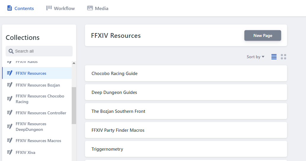
The Contents Tab
On the CMS, in the Contents tab, you will see a section called Collections, and those then have pages.
- Collection: Essentially a folder structure. You will be told where you will need to place your guide. If it is a multi-page guide, the first page will be in the FFXIV Resources collection, while the other pages will be in their own collection.
-
Page: The actual page you can edit! You can create a Page by clicking on “New Page”. Don’t use the Quick Add button. Pretend it doesn’t exist.
- Alternatively, you can also create a Post from the Workflow tab.
Development Notes:
- At the moment, Collections cannot be created on the CMS so you do need to wait until it has been created for you.
The Workflow Tab
At the moment this isn’t super necessary to learn about, but let’s cover it for the future.
You can create a Post there and it will ask for which collection.
Most importantly, it has 3 categories: Drafts, In Review, Ready.
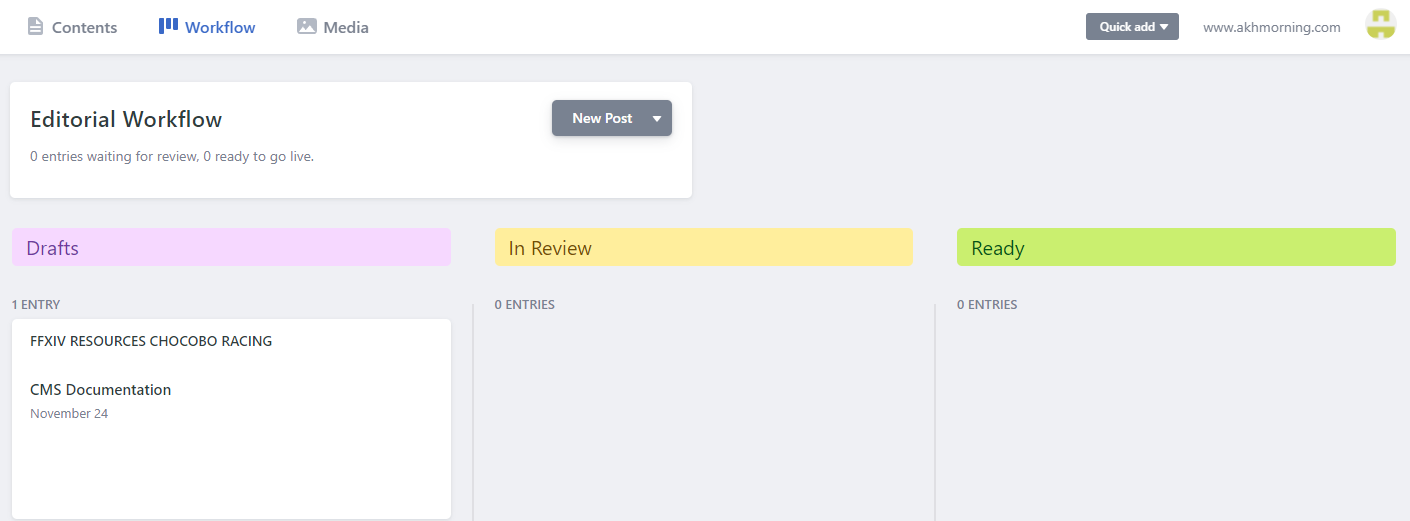
Ideally, these would work has follows:
- Drafts: still being worked on
- In Review: the author believes it is ready, but it needs to be reviewed
- Ready: the reviewer agrees it is ready, and therefore this will be published
But right now it’s not really used much.
Media Tab
A place to upload images. You don’t usually need to upload them via the Media Tab, as there are other ways to upload them within a Page; This will be covered more later once we talk about Modules.
Pages
The meat of your guide-making! Regardless of whether you hit New Page on the collection, or on the Workflow tab…
Give it a title and hit that Save button and you should see the URL change accordingly!
BOOKMARK YOUR PAGE!
Development Notes: The reason why it has to be bookmarked is that at the moment, the Page won’t appear in the collection until it has been committed in github at least once. Once it gets its first commit, or once this workflow issue is fixed, you won’t have to bookmark it anymore, but until then, bookmark it! Likewise, if the title is changed, the URL in the CMS will not change until it has been committed.
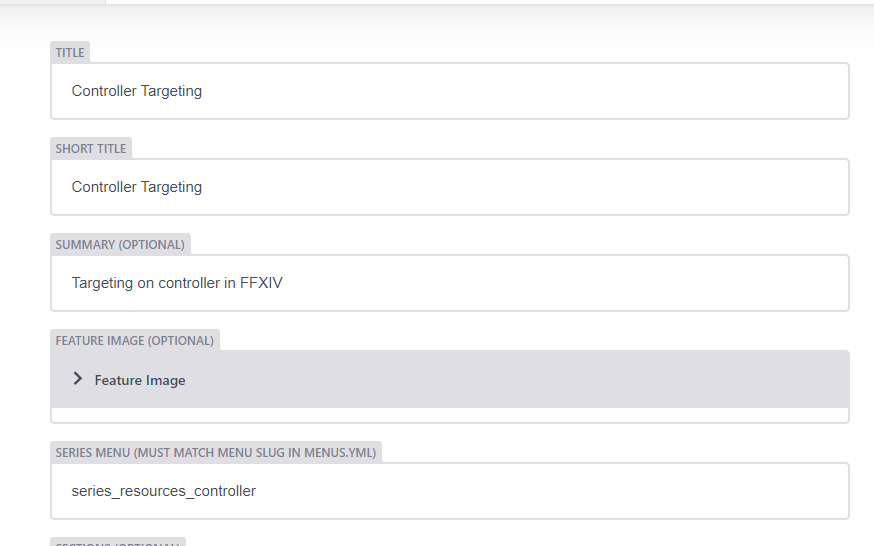
Title
The title of the page. This will make it the page’s H1.
Short Title
(only for collections that are flagged for a series)
This is the alternate version of the title that shows up in the top-level navigation. Most of the time you’ll make this the same as the Title.
Summary
The description is for metadata - this is data that is used by things like google search engines, so fill it out.
Development Notes: This does not appear to be properly working, as if I go to a guide (ex: controller guide), the metadata description is the generic AkhMorning description, which will hurt its search engine capabilities.
Feature Image
The banner image for the guide. If left blank it will use the default one. Don’t bother changing any of the positions.
Series Menu : From “Slug”
(only for collections that are flagged for a series)
This is for multi-page guides (ex: The controller guide). This will say which series (multi-page) menu it will use. This will be provided to you.
Filling this out does not add the Series Navigation yet, but it is required for it to work.
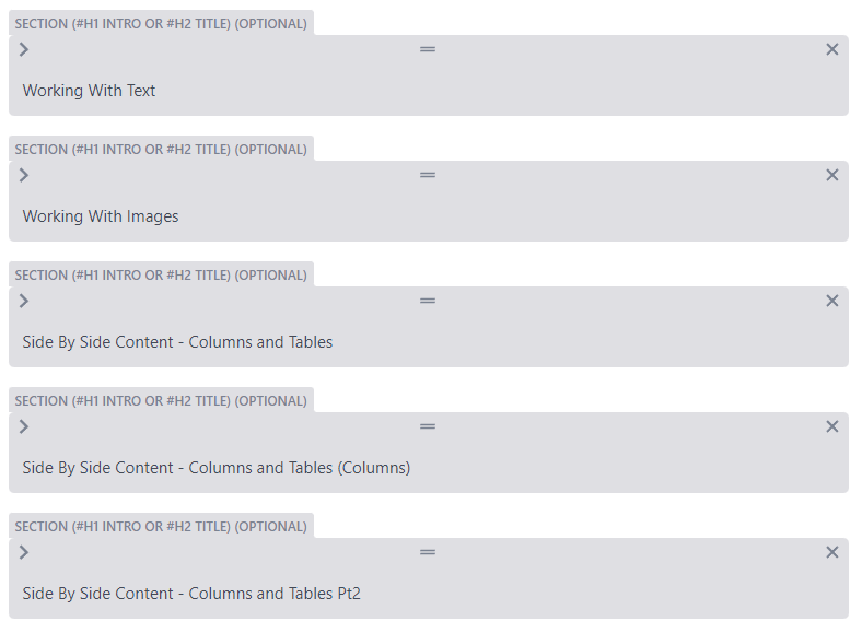
Sections
The stuff where the actual guide goes! Sections are important, so….
Sections - Detailed
As stated earlier in the guide, sometimes you might want to break something into its own H2 to make it easier for people to click in the navigation. That’s what just happened right here.
A section is made up of modules. Modules are where text and images will go, the section itself is a logical container for those modules, though it does have a few of its own properties.
Section Name: The logical name of the container. This does NOT appear on the page and no it is not actually optional. It only says optional so as not to break existing guides that do not use this guideline.
There are some general guidelines for what you should put into Section Name.
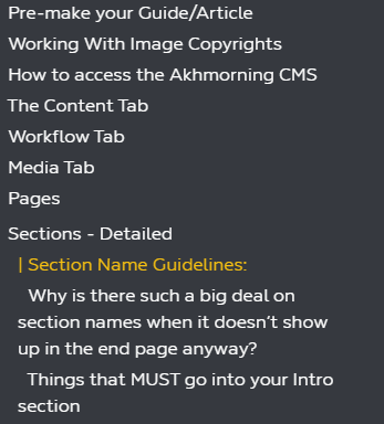
Section Name Guidelines:
- Header 1 Intro. You can write “Intro”, or the whole title, but it can be normal to have an intro paragraph at the very beginning of your page. This “intro” section would also be used for modules that are meant to always be at the beginning of the page.
- Header 2 name. Most of your section names will be named after the H2 content that will go into it. You shouldn’t have more than 1 H2 per section.
- There may be some times when you might have multiple sections for a single H2, though, because some modules are simply better off in their own section. You can use something like “[H2 title] - columns”, “[H2 title] - continued” or “[H2 title] - part 2” (with [H2 title] replaced with the relevant H2 you are using) .
Why is there such a big deal on section names when it doesn’t show up in the end page anyway?
Because it shows up on the CMS itself and that makes it easier to edit in the future.
Things that MUST go into your Intro section
Even if you don’t have an actual intro for your guide, which is not required at all, you will still need an Intro section for the following two modules:
- Author - For all single-page guides, and for the top-level page on multi-page guides. (SPECIAL NOTE: no longer true in newer layout? This still needs to be confirmed)
- Series Menu - only for multi-page guides.
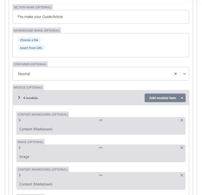
Adding a Module:
Click “Add module item” and pick the relevant module.
About Modules
The module list is Alphabetical, and contains certain modules that:
- Are easy to use and will be the main modules you use
- Can be used, but will require some backend touches not available in the CMS
- Shouldn’t be used at all!
So it was difficult to figure out a good order for the documentation. Alphabetical order is great for certain things, but not necessarily for a guide on getting people started; it’s far better to focus on what people will actually use first in those situations. So instead they’re by categories, but here is an alphabetical TOS if you want it too:
Some modules might be listed multiple times if they can be used for multiple categories. The primary category will always be first.
| Module | Category |
|---|---|
| Author | Do not use ? (Under review) |
| Accordion | Text - RTE |
| Blurbicon | Text - RTE |
| Blurbrefer | Text - RTE |
| Changelog | Text - RTE |
| Changelog | Navigation * |
| Column | Columns |
| Content (Markdown) | Text - RTE |
| Content (Markdown) | Navigation * |
| Datatable | Tables |
| Gallery | Images |
| Iconlist | Other (not working?) |
| Image | Images |
| Interview | Text - RTE |
| Leaderboard | Tables |
| Macro | Text - Not RTE |
| Note | Text - RTE |
| Post Tiles | Do not use |
| Series Menu | Navigation |
| Streamers List | Do not use |
| Tweet | Other |
| Video | Videos |
| Video Select | Videos |
| VM Ad Placement | Do not use |
Modules listed as Text - RTE can also be used for images or tables, though some modules may have weird styling.
Read more in their respective sections:
Although tables are composed of text, for the purpose of this organization, they are considered their own category.
Development Notes: Although most modules have a title, the title does not show up in the CMS when collapsed. It’d be nice if the CMS could grab the module titles like it does the section titles to show them, to make it easier to find things. That being said, as a person using the CMS, those titles are important as for most modules they will actually show up on the page!
Adding Navigation
Series Menu Module
This module is required if your guide is a Series - that means a multi-page guide. This module allows the menu of each page to show up. This should always be the very first module of each page in the series, including the first one. This module just has one property, which is for it to be active.
It checks against the “series menu” property of the page itself. This will have been given to you to fill out.
Content (Markdown) - For Navigation
The Content (Markdown) is a text module, so it will be covered some more in the “Working With Text” category. It’s also the primary module whose H2 and H3 will be added to the navigation. Sometimes you might add a Content module just to put a H2 or H3 before another module, so the navigation menu ends up perfect.
Be very careful with your H2 and H3 titles not to repeat! This can confuse the navigation since in the code it would be a link with #what-ever-you-put
So if you repeat your headers, even if one is a H2 and another is H3, that can really affect the navigation!
There is one more module that can affect your side navigation.
Changelog - For Navigation
The title for the changelog will also show up as a top-level navigation (H2).
The Changelog module is shown at the end of this guide.
Working With Text
Content (Markdown) Module
The module you will use the absolute most for putting in text! It’s also the module that drives the navigation on the side through its H2 and H3.
This offers a Rich Text Editor or Markdown, which some other modules in this section also use. So let’s talk about it.
Rich Text Editor / Markdown
The following modules have the RTE (or Markdown):
- Content
- Accordion
- Interview
- Note
- Changelog
- Blurbicon
- Blurbrefer
The Rich Text Editor (RTE) is sort of a preview, though it won’t have the same font colors and sizes as the real thing.
Then there is Markdown mode, which lets you do everything that the RTE can do, but using a markdown language.
| Element | Markdown Mode |
|---|---|
| Bold | **Bold** |
| Italics | *Italics* |
Small code blocks |
` Small code blocks ` |
| Header 2 | ## Header 2 |
| Header 3 | ### Header 3 |
| Link | [Link](#header-here) |
You can create links to other pages or to sections on the page too.
Small Code blocks are very useful if you want to talk about a macro with < or > in them.
Link to another section in the same page
For the link, you provide what’s in the header, but change spaces and special characters to -
Back to top of Working With Text
[Back to top of Working With Text](#working-with-text)
Notice capitalizations are gone! This is actually important.
Always test all links after you get it published to staging! If one isn’t right, just locate the header in the article and check the URL bar or right click -> inspect to check the ID in the code.
Also keep in mind that if you change any headers, you might end up breaking internal links!
Link to another page in Akhmorning
You can of course provide the full link if you have it, but you can also provide a partial link such as /resources/controller-guide/ . Basically whatever would come after the .com. This is useful for allowing the links to work equally well for staging and production versions of the site.
Partial Link to Controller Guide
[Partial Link to Controller Guide](/resources/controller-guide/)
Block Quote
This is a block quote. Notice the indentation.
> This is a block quote. Notice the indentation.
Bullet lists
- List
- of
- things
* List
* of
* things
You can also use - instead of *
Numbered Lists
- List
- of
- things
1. List
2. of
3. things
Add images
(learn more in “Working With Images” -> Rich Text Editor)
Large Code Blocks
This is a large code block.
It can span multiple lines
Markdown Only
There are a few extra things not in the Rich Text Editor if you use Markdown mode, which are:
Strikethrough:
Strikethrough
~~Strikethrough~~
Horizontal Line:
---
And tables, which will be covered some more in “Side By Side Content” -> Tables in Rich Text Editor / Markdown.
Macro Module
While the code blocks in the various modules that support Rich Text Module/Markdown are great, especially the large code blocks, it’s not the only way to feature text that has special characters. For anything that a reader is likely to want to copy/paste, the Macro module is great because it has an easy “copy” button.
It’s technically meant for FFXIV macros, but there is nothing enforcing that. So if there is some other type of content that would benefit from having an easy copy button…go for it! Or even if you just like the aesthetic.
After all, this is the only text option that has a dropdown that lets you show different things.
There is no RTE/Markdown though, which is on purpose since the whole point is to not have to worry about code removing special symbols.
The Heading is the title that goes above the border, and then you add macro items. The macro titles show up as the list. The title is currently required, though you might see older pages without it. The title is the identifier for multi-item modules, so if you accidentally give the same title to multiple items, it will always pick the first one!
Macro Module In Action:
This is a macro you can copyThis is a second macro you can copyNote Module
Notes are great for things like tips, or anything you want to see stand out. You’ll need to pick out a SVG - that’s an icon image. SVGs, in this context at least, are meant to be just small icons so this doesn’t count as an “image” module. That being said, if you do want a custom icon, do ensure you follow the guidelines for image copyright.
Note module is RTE/Markdown enabled.
Development Notes: At the moment, you cannot upload a SVG nor easily preview the existing ones. The only way to get a new SVG is to have someone upload in the backend.
If you’re not sure what SVG to use, just pick “information”. It’ll fit most settings!
If you have multiple notes, you can go back and forth between information and info-circle, so it looks more varied.
Accordion Module
About Accordions
Accordions are collapsible text sections. They’re great for optional or “read more” information, and can help the guide look less long for your audience. Keep in mind that accordions do NOT show up in the navigation list, not even if you put a H2 or H3 inside of them. If you really want them to show up in the navigation, you’ll need to add a H2 or H3 in a Content module before it.
The title of the accordion always shows up, even when collapsed.
Just like the Content (Markdown) module, the Accordion module supports both a Rich Text Editor and a Markdown.
Interview Module
Interview modules will ask for an author (optional) and a role of either interviewee or interviewer.
The author must match what is in the Author list, so you may need to ask as that is not editable. Otherwise you can just put it some invalid text to force it to be blank. Leaving it blank may cause it to be confused.
Development Notes: Searchable authors would be nice, and a few “standard” authors such as Anonymous, Question, and Answer.
What is an interview module good for ?
They’re used a lot in Interview articles, or other articles that might have a greater emphasis on opinion
What if I’m making a guide ?
They’re not used as much in guides as those tend to be more objective. However, that doesn’t mean they can’t be used (sparingly). They are great for a very short Q&A of 3 questions or less, or if you want to add a tip that’s a bit more subjective.
A more objective tip, something that applies to everyone, fits better in the Note module. However, something more subjective, or even a comment about how difficult something was to you as the author/tester, can make a great little flair to a guide - just keep it to only one or two per page.
This module does have RTE/Markdown.
Blurbicon Module
Primary used in overview pages (for example, the Black Mage page has blurbicons to the Black mage guide, bis, and faq guides/articles).
That being said, if you wanted to make a special link and have it really pop out, you could use the Blurbicon module. You can choose to have either an icon, or use an image, to accompany the link.
The summary of the blurb, which is optional, does support RTE/Markdown, and blurbs do change color when hovering so it can be a great alternative to a Note if you’re featuring a community site, for example.
Blurb Icon Module With 2 Items

Blurbrefer Module
A Blurb refer is very similar to a blurb icon, but it comes with two pre-made icons for discord and website link. Blurb refer does not come with a SVG option, only an image option.
The “optional” information, including the image, are not really optional at the time of writing this documentation. Check Blurb Refer 2 below, where everything except Title & Content were left blank, to see why.
Development Notes: If website, image, and/or discord are left empty, the appropriate icons should not show up.
Changelog Module (For text)
See end of guide
Working With Images
Image Module
The image module will be the primary way to add images, though it is not the only way.
The module is mostly self-explanatory. You have an image title, a file, and width. The file is listed as optional but obviously it is not really optional. This is just in case you need more time to get the picture, you can at least put in the module and add the image after. It will show up as a broken image icon on the page.
Images Best Practices:
Image title, while listed as optional, should be treated as if it’s not. Place your caption here.
Development Notes: It might be less confusing if “Image Title” was renamed to “Image Caption”. The width/height (PX) needs the ability to allow % and automatically switch if a % is in there. Right now the only way to use % is via backend.
If your image has lots of text, like the one below, you likely will need a width of 700 - 1000 px. You can just leave it empty and let it attempt to use the full size of the image, which will automatically make it as large as the module will allow, but sometimes that can make things look TOO big.
Gallery Module
A list of multiple pictures. They show up kind of side by side using a standard width and the person clicks on it to make it larger.
Development Notes: This module needs to have the ability to “go next” once a person opens up an image. It also needs to have support for showing image caption/title somehow as while it looks fine for distinct images that come out great in the gallery size, it would be quite difficult for images that are full of text and meant to be “optional” images for the reader to choose to click to make bigger.
Gallery Module

Opener/Rotation Modules
Coming soon!
Images via Rich Text Editor/Markdown modules
You can add pictures to modules that have the Rich Text Editor by clicking the + icon and selecting image. You can also use markdown notation if you prefer that.
In this version of Image, there will be a Title and Alt Text. Put your caption in both.
Careful with the Content module and pictures!
Notice how the Image that comes with the Rich Text Editor modules doesn’t have a width/height setting? It’s not possible to set that other than via the CSS for the site, or directly overriding in the page’s code in the back. The markdown language used in the CMS does not have the expanded options for setting image size.
For Content (Markdown), the CSS has a very small width of 24 pixels, so the image will come out very very small. This is because it’s meant for in-line icons. (The Changelog module also has a size of 24px). If your image is an in-game icon, such as an action icon, then go right ahead and use the Content module if you want to, but otherwise you’ll need an Image module.
For example, here is an image via the Image Module:
Now here is that same image but with different modules using the Markdown image method.
CONTENT MODULE WITH IMAGE

Accordion With Image
Interview With Image
Note With Image
Blurb Icon Large With Image
The Markdown method does not allow you to specify an image size. That’s why it defaults to the size specified in the CSS for that module. This is also why the image might look very large in some modules that don’t specify a size at all if your image itself is large.
If your picture ends up too large in one of the other modules, such as the accordion module, you may wish to upload a version of the image that’s been resized to the desired size.
Changelog With Image
This example is at the end of the guide due to navigation conflicts.
Columns
Column Module
Columns allow content to appear side by side. Because of the way the Column module works, this needs to be in its own section. So you will need to make a section, and probably give it a name like “[H2 title] - Columns”, and then if there was more content you wanted after for your H2 that isn’t in the columns, you’ll need to make another section to continue it.
You make a column module for the amount of columns you want, and then a module item within it. Module items are basically modules within columns.
Careful with Columns!
Keep in mind that columns effectively reduce the width available for what you are showing. This can make it a very unpleasant option for:
- Long paragraphs of text, because it will lead to an enormous amount of text-wrapping
- For images that have text in them, since that text will end up resized to be smaller depending on the page style!
The page style will adapt to different screen sizes, forcing the columns to stop being columns at different sizes, so it should be fine on small screens, and even removing the side panels to claim more space, but do be extra careful with images that have embedded text. If using images with embedded text, don’t do 3 or more columns.
If using actual text, make sure that you don’t have too many sentences in a paragraph - space things out.
For a video embed, those are best for videos with lots of audio content that don’t require much reading.
Development Notes:
- Right now the list of module items only has Content (Markdown) and Accordion. Video and Image module items should also be enabled. Other modules like Note, Interview, Macro, etc… could also be quite interesting if allowed as a Column Option. It is possible to override these restrictions in the backend, just not in the CMS.
Other modules that effectively have column support
Technically speaking, the following modules effectively have their own built-in column support of sorts:
- Gallery: shows multiple pictures in a row
- Blurb Icon: Multiple links (with icons/pictures and descriptions) in a row
- Blurb Refer: Multiple links (with pictures and descriptions) in a row
- And of course, tables, which will be discussed in the next section
Tables
Datatable Module
Data tables are pretty tables that show up on the site. However, the CMS currently does not really let you set this up.
Instead you have to ask someone with backend access to convert your table to an actual code file, and then you will be provided the table ID so the CMS can find it.
Level selector allows for filtering based on a category. This is also embedded in the code so make sure to discuss this. Examples of level selector can be seen in the Allagan Studies sections for Stats
Development Notes: It would be much easier if something allowed a person to upload a CSV, provide an ID, and have it automatically convert it to JSON - and of course the ability to pick from a list of existing tables. Alternatively, instead of storing in files, this would be a great candidate for a NoSQL database.
Leaderboard Module
A special table just for leaderboard competitions.
Add reports items to list #1, #2, #3, etc… Reorder the items using drag & drop if they are out of order. Report ID can be used to link externally to FFLogs. Guild Name shows up as the item. This module is really meant for FFLogs and cannot really be utilized for other creative means.
Development Notes: At the moment, this module is pretty much unusable from the CMS. You can add it in as a placeholder just so you remember where you want it, but the actual implementation will need to be worked with someone who has backend access.
Here is a link to a page that utilizes it well.
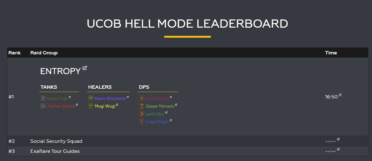
Leaderboard Placeholder
| Rank | Raid Group | Time |
|---|
Tables via Rich Text Editor / Markdown modules
There have already been several times in this document that tables were created without using any of these modules. Those are done by using a module that supports the RTE/Markdown and using a markdown table. The style might not be the same for all modules, so here are examples of each!
Table Via Content Module
| Header | Description |
|---|---|
| Item 1 | Desc 1 |
| Item 2 | Desc 2 |
| Item 3 | Desc 3 |
| Header | Description |
| ------ | ----------- |
| Item 1 | Desc 1      |
| Item 2 | Desc 2      |
| Item 3 | Desc 3      |
Yes, you must include that second line with the many - in it, however you can just do 3 -. The markdown engine will adjust it as necessary.
Table in Accordion
Table Via Accordion Module
| Header | Description |
|---|---|
| Item 1 | Desc 1 |
| Item 2 | Desc 2 |
| Item 3 | Desc 3 |
Table Via Interview Module
Header Description Item 1 Desc 1 Item 2 Desc 2 Item 3 Desc 3 Not really sure why this would be used in the Interview module, but hey, maybe it’ll fit your guide/article!
Table Via Note Module
A small table might look nice in a Note module
| Header | Description |
|---|---|
| Item 1 | Desc 1 |
| Item 2 | Desc 2 |
| Item 3 | Desc 3 |
Table via Blurb Icon Module
Table Via Changelog Module
This example is at the end of the guide due to navigational conflicts
Working With Videos
Video Module
An embedded video. Pick from the allowed types and then put the video ID. Don’t put the whole URL.
The first video below has a title, the second one the title was left blank.
Video Select Module
An embedded list of videos. The user can then pick a video. This is also useful for having a single video if you want the pretty border and title that the regular Video module doesn’t have.
It otherwise works the same as the Video module - pick a source, then put video URL or ID.
Development Notes: If the below doesn’t show the video titles, that’s a bug, as they were provided and NOT left empty in the module itself. Also video title shouldn’t be listed as optional.
LYON'S REMATCH POVS
What if I want to feature a video that isn’t on the list of sites in these modules?
Talk with upper management.
Other Modules
Tweet Module
Features a tweet. You’ll need the embed code, not just the URL
Endwalker's Schedule until Patch 6.05#FFXIV #FF14 pic.twitter.com/zifXmL1iCZ
— AkhMorning (@akhmorning) November 6, 2021
- Coffee
- Tea
- Milk
Development Notes: The above is a list and an image via HTML, and NOT markup, (the image does have width %). Does this mean this module can be used to include any custom HTML/script? Can potentially be seen as a great alternative (especially embeds for other social media stuff that's not twitter), but it could also be a security risk.
Author Module
(Do not use ?)
If using the Author Module, you will be provided a list of Authors. Comma-separated if multiple authors. This module used to be required, but as the layout is changing, it is no longer in use for the time being…maybe?
Development Notes: A search feature would be better. Needs clarification on whether Author module is still needed or not for the new layout.
Iconlist Module
(Not working)
It might be usable with backend assistance, maybe, but as of right now this is listed as non-working. This is a list of links with icons.
VM Ad Placement Module
(Do not use)
Ignore this, it shouldn’t even be on the list.
Development Notes: Hide this module
Streamers List Module
(Do not use)
This is a very specific module for very specific pages that are not built via the CMS directly.
Post Tiles Module
(Do not use)
This is a very specific module for very specific pages that are not built via the CMS directly.
Changelog Module
Meant for pointing out changes to the documentation. This is optional, discuss internally if a changelog is necessary. Even though the module calls the records “tables”, they’re not really tables - they’re more lists.
Keep in mind that the title for your Changelog module WILL show up in the navigation!
Development Notes: The title still shows up in Navigation if left blank. If that remains, having a title should be a requirement.
Changelog can be used for other things where the overall aesthetic might benefit. For example, a guide with examples of a player’s progression could be done via a “changelog” of phases.
Just keep in mind that only the title shows up in Navigation, and not its relevant H3 titles. So if you want people to be able to see those in the Navigation, then Changelog would not be appropriate.
* The above statement might be inaccurate as currently navigation with Changelog breaks, so it’s actually possible that Heading might be meant to show up as a H3 in the navigation and just not working properly.
Development Notes: The Changelog module seems to break the navigation scroll’s ability to adjust to where one is within the page. For the time being, anyone using this should save this as the LAST module of a page.
Changelog Examples
Initial Draft
Migrated from Google Docs to CMS. Various “testing” items were added.
Change + Image Example
Version 2
2021-11-24
Many “testing” items removed. Adjustments to headers due to conflict in navigation.
Changelog + Table
| Header | Description |
|---|---|
| Item 1 | Desc 1 |
| Item 2 | Desc 2 |
| Item 3 | Desc 3 |
Version 3
2021-11-25
- Changelog moved to bottom for navigation reasons
- Alphabetical module navigation added via many manual links
- Images resized for legibility
- Various minor clarifications